Web Consolidation
The organization has fragmented content across many poorly performing and low traffic web pages. This makes it difficult for users to find the information they are looking for. It is also difficult for the organization to maintain.
Outcomes
Designed user experience strategies that helped reduce and improve the content for a non-profit with millions of web pages.
One section of the website was reduced by 75% from 20 pages to 5 pages.
Another section saw a 28.8% lift in referrals.
In general, page templates needed to support most content were reduced from 20+ to 3.
Product Type: Multi-platform Design System
Role: Design, Usability Testing, User Research, Content Strategy, User Experience
Organization Type: Nonprofit
Simplifying an Overly Complex Web Structure
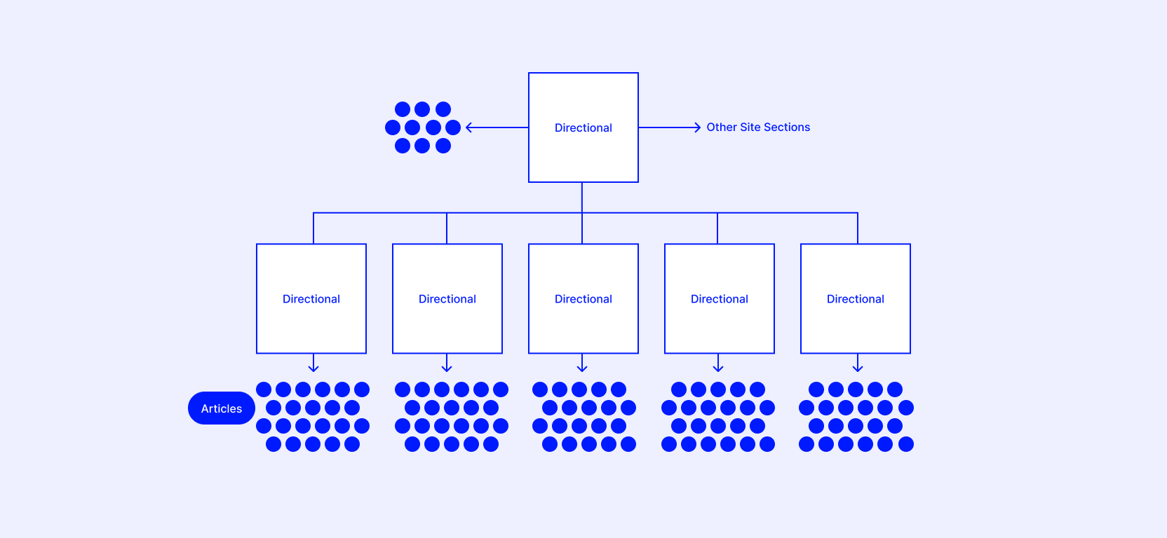
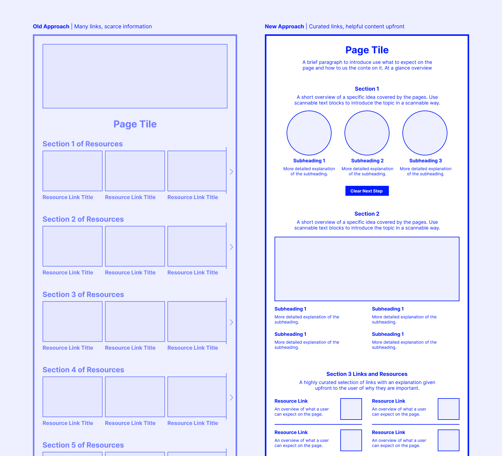
Below is an example that illustrates how many sections of our website are link collections that link to other link collections. This makes it challenging for users to find helpful content. These link page are also light on content with a lack of helpful information for users. Compared to other areas of the website, these kinds of pages get very little traffic.

This is another view of how we have lots of content buried underneath links pages. To further complicate the situation, much of these article pages are outdated and not used regularly.
I developed user experience strategies that worked in tandem with our content strategies to simplify how these sections of the website are structured.
This includes consolidation of content, reducing the number of choices a user needs to make.
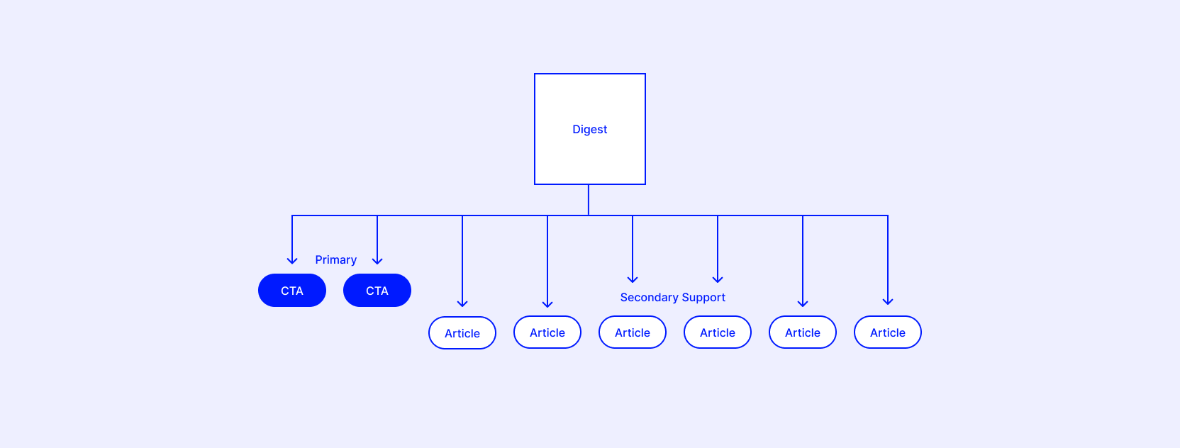
This shows how in many cases we are able to go from pages full of links to pages with helpful content upfront, a CTA or two, and then secondary supporting articles. This strategy is being applied across the website.
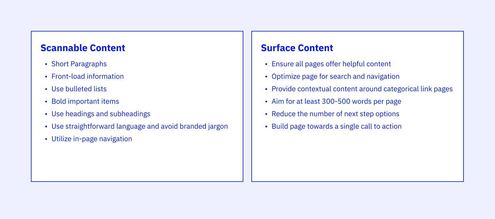
While going through this process, I also noticed that much of our content is not formatted for people reading on the web. Very often our pages are written in dense paragraphs and lack cues that facilitate scanning.
Combining internal research that our team performed with sources from the Nielsen Norman Group, I created a series of guidelines for scannable web content. Additionally, I was able to teach these best practices to the org in a cross department training conference to branch these ideas beyond my immediate projects. Here is a general overview of these best practices:
These principles have been applied to many content sections on the website. Here are some of the results:
For one section of the website the number of pages required to maintain was reduced by 75%; 20 pages to 5 pages.
Another section saw a 28.8% lift in referrals.
Page templates needed to support most content were reduced from 20+ to 3.
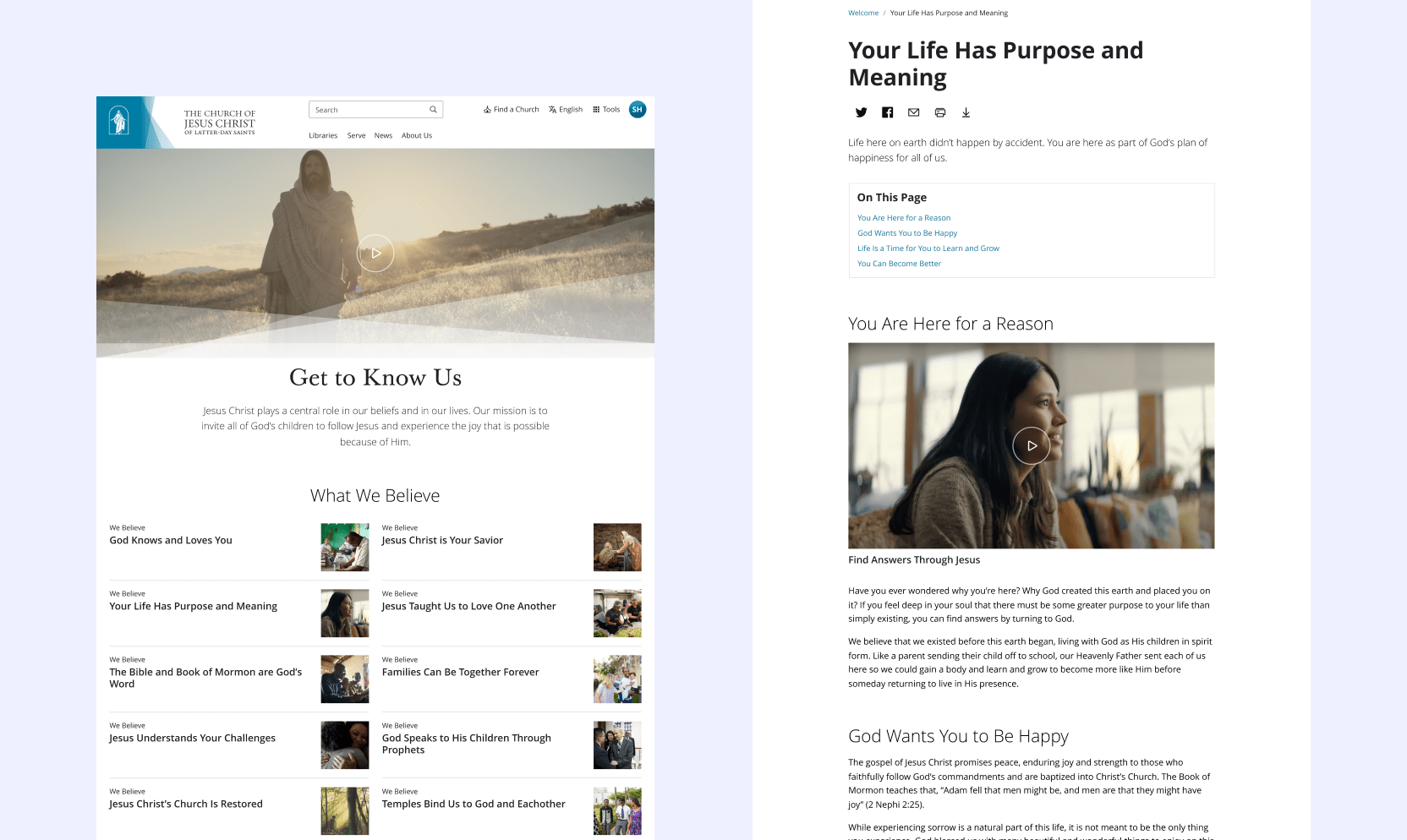
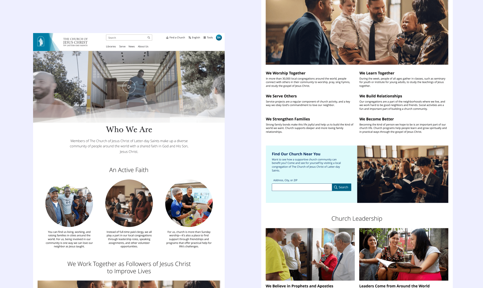
Page Examples